Visual identity 2027
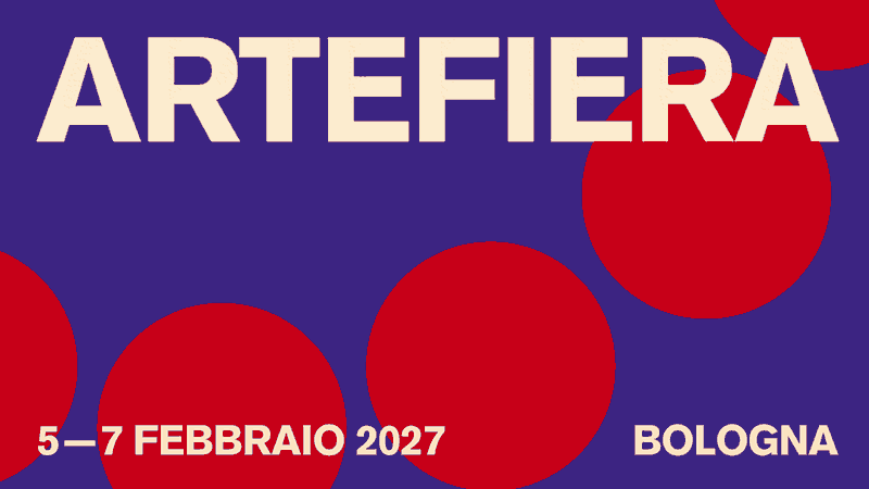
Arte Fiera 2027’s visual identity is closely linked to its title, transmuting time into an uninterrupted chromatic and kinetic flow. On a deep blue background, we see an arch of bright red circles that rotate with clockwork fluidity. The continuous movement of hands and the naturalness of performance eliminate perception of the click and reveal serene, constant time: a silent and solid mechanism in which the fair’s history is viewed not as a series of isolated events, but as a harmonic evolution that nourishes the present.

Arte Fiera’s new visual identity is conceived by Al mare. Studio.